Has the sidebar gone the way of the Dodo bird? When the Internet first gained popularity in the 1990s, the website sidebar was an excellent way to capture readers’ attention, gather email addresses, and point them to a CTA. However, as websites and tastes have evolved, the sidebar is becoming more and more obsolete.

Should You Remove Your Website’s Sidebar?

MINIMALISM

The current trend towards minimalism means websites are becoming increasingly pared down. Users are demanding a more streamlined experience. To improve UX, designers are removing clutter.
The sidebar falls into the clutter category. Ask yourself, “Is there anything on my site’s sidebar that cannot be achieved in another way?” Is the information in the sidebar repeated on the top navigation? Or could you put the information in another spot?

The question when it comes to sidebars is not if they should be removed from every website. The most important question is, “Does this feature add value?”.

EFFECTIVENESS

If you steadfastly want to hold on to your sidebar, examine its effectiveness. Is it driving conversions, email signups, or other growth for your business? Is it user-friendly? Is your sidebar adding to your website instead of detracting?

The reality is that it might be negatively impacting your website and traffic. If your sidebar currently has a CTA, you may get better results by inserting the call to action in the text of your page instead.
Of course, different websites have different purposes. E-commerce sites commonly use sidebars to categorize products. Google’s sidebar uses widgets that are helpful and used across its different platforms. For these sites, sidebars help users navigate their content in a straightforward way.

However, your law firm’s website probably does not need a sidebar. If your aim is to inspire potential client’s to call your firm for services, they are neither buying a product online or using a web-based service, as in the case of e-commerce sites and Google.

Your CTA is straightforward, whatever way you word it: contact us for expert legal services. By removing the sidebar and inserting the CTA directly into the page, either mid-page or at the bottom, you could increase responses.

RESPONSIVENESS

All websites must be mobile responsive. In the early 2000s, responsive design was not an imperative and many clunky websites with features like sidebars and overwhelming ads were built. In the modern age of smart devices, responsiveness is no longer an added bonus. It is critical.

Sidebars inhibit responsiveness. They do not show up in mobile correctly and are usually redirected to the bottom of the page. This disrupts the design and misses the entire point of a sidebar. Without one, content can be moved around and the site’s width can be shrunk easily.

Another key factor to user experience is speed. Without a sidebar, your site will load faster. This can decrease bounce rates and keep users from leaving your site immediately — as often happens to sites that don’t load quickly enough.

OPTIONS

As website design has progressed, there are so many more options available for information on your site. The sidebar held the spot as the prime place to put extra information, drive people to sign up for newsletters, and blast your CTA.
This is no longer the case. There are so many options! If the content in your sidebar is essential to the site, and cannot be eliminated entirely (remember, minimalism), consider these other choices:

A sidebar is no longer needed to share additional information on your website. With the plethora of design options available, you can engage users without the outdated sidebar.
Sidebars had a heyday of popularity in the early 2000s. You’ll still see it commonly used on blogs and e-commerce sites. But your law firm’s website probably does not need one anymore. Getting rid of it is a chance to streamline your site and improve the user experience for potential clients.

You’ll notice that our website does not have a sidebar. They add to visual clutter and weaken the overall message of the page. We’ve found that people respond to straightforward CTA buttons rather than distractions on the side of the page.

Take a look at your firm’s website. Are you still using a sidebar? Is it adding value to the site? If not, it’s time to remove the dead weight. If you are truly worried about the effects of removing it on your site, you can try A/B testing to quantify your results before making it permanent.

One thing is clear. If your sidebar is distracting and unnecessary, kill it.

Article: Original Source
Does the content on your website keep people reading or does it make them run and never come back?

As a lawyer, you want to give your customers a good first impression. You want your content to be meaningful and helpful, but also readable.

Avoid using long walls of text

People are scanners. Which means, they scan through your blog post to find anything that would help them, and if it’s just a wall of words, they gloss over it and leave.

Write your content for scanners.

You have to break it up with white space, subheads, bullet points, numbered lists and images.

People are lazy and want reading to be easy for them. If they find it too hard to read, they can do a google search for the same topic or services you provide and move on. You’ve lost a potential customer because your copy wasn’t easy to read.

Use short sentences. Avoid run-on sentences, bad grammar and check for spelling mistakes. If you follow those suggestions, you will avoid having a wall of text in your content writing.

Make sure you address your target audience

Understand who your readers are and pinpoint what they want. You want your potential clients to feel like they’ve come to the right place.

When people go to a lawyer site, they are looking for a lawyer to solve their specific problem. If you address that problem in your content writing, you will gain a customer. Develop a buyer persona and study their needs and desires. Then write your content with them in mind.

Include a solution to your potential client’s problem

Make sure your potential clients know what your firm can do for them.

Your firm has features and benefits for your ideal customer. If you don’t show the benefits and only list the features, they won’t know what’s in it for them or why they should choose you.

Your features let your audience know the facts and the descriptive side of what you offer. People don’t respond emotionally to a list of facts.

When you show your audience what they will receive when they use your service, this is results based. Showing the benefits helps your audience make a decision as to why they should choose you and your service and not someone else’s. Your audience has several concerns, fears and desires. When you speak to those concerns your audience will respond emotionally. People always buy with emotion first.

Be sure to put clear benefits in your content writing, and not just the features.

Include a Call to Action

Write a compelling call-to-action.

Your audience wants to know what to do next. Give them something of value for free that speaks to a specific problem you can solve. You can highlight your most important benefit and give them a special discount. Or give them an ebook that solves a particular problem.

Always include a call-to-action at the end of your blog post. This will insure that those who are interested in your legal services, will take action and engage with you.

Ask yourself, “Why would they want to buy from me?” Use their language when you talk. You may want to find out where they hang out online and write down what they are saying. Then use those words in your content writing.

Here’s an example of what you want to avoid

At The XX Law Firm, we provide sophisticated legal representation to individuals, businesses, and organizations in a wide range of civil litigation matters, including labor and employment, civil rights, government litigation, business litigation, personal injury, and whistleblowers. We represent clients  in the X metropolitan area, the State of X, and X. Our practice focuses primarily on federal court litigation, but we also handle cases in state courts, before government agencies, and at arbitration proceedings.

The first thing you notice about the above paragraph is that it is a wall of text.

It lists all the features and doesn’t appeal to a specific target audience.

Here’s an example of how it could be written with an audience in mind and showing what results or benefits are in it for them.

Quality comes first at The XX Law Firm. Your legal case is important to us whether it’s personal or business related.

If your case involves a domestic assault, and your future looks bleak, let us handle all the legal matters and put everything back into perspective for you.

Or you’re facing an embezzlement case in your business, don’t be afraid to reach out to us to help and stand between the offender and you so that your company can get back to being a business people can trust.

We offer legal services in several areas. No need to feel your case is either too big or too small.

We represent clients in the X metropolitan area, the State of X, and X.

Reach out and call us to help you through some of the toughest times of your life. We provide sound advice and a clear direction for your specific legal matter.

Content writing can keep your readers on your page longer if you learn and practice these techniques. Focus on solutions and directly appeal to your audience’s feelings. Remember to ask yourself, “What does the reader want?”

Does your website tell your clients how you can help them and specifically point them to ways to contact you?

Karin Conroy helps lawyers have better websites that more effectively reach clients. If you don’t have the time or inclination to optimize your website to reach potential clients, she can help you do that.

Article: Original Source


It seems that website sliders are everywhere. Open up the homepage of a modern website or try to buy a new WordPress theme that doesn’t include sliders and you may have trouble. There’s one major problem though. Sliders, or carousels, are NOT effective. If your law firm’s website features a slider, or you are looking at building a new website, here are 5 reasons to reconsider this feature.

5 Reasons Why You Need to Ditch Your Website Slider

1. SLIDERS ARE DISTRACTING

When a user lands on your website, an automatically moving slider is distracting and unnecessary. Our eyes are wired to detect movement, a vestige of humankind’s early days in the wild and being able to see predators early on was life-saving. Now that we are ensconced in houses with fancy laptops, any movement is distracting. When we see movement on the screen, such as a popups, sliders, and automated graphics, it detracts from the overall experience instead of adding to it.

If your slider is photos, it distracts users from reading your content and can cause them to close the website. If your slider features ads, having multiple ads is less effective than having one. Choosing one allows users to focus on one featured ad, instead of trying to read multiple slides as the carousel changes automatically (not giving them a chance to fully read each ad). Hands down, sliders bring UX down.

2. SLIDERS LOWER YOUR SEO

A featured slide takes up a lot of space on your homepage. This is valuable real estate on your website! The distracting slider requires a lot of space for a feature that only 0.22% of users click on. Instead of wasting space on the slider, you could move your valuable content and CTA higher on the page.

If your law firm website features a slider, it’s possible that most of your content is pushed down below the fold. Google has stated, since 2012, that pushing down content is harmful for SEO. When users search for something and click on a website, they are frustrated when the content is not readily available. Having to scroll past a slider lowers UX and Google may penalize accordingly.

Many sliders feature a different H1 tag for each image. This is confusing for the user and lowers the effectiveness of your keywords. Changing the H1 tag with an automatic carousel is harmful for SEO efforts.

3. SLIDERS ARE BAD FOR MOBILE

Web designers use desktops to create websites. What looks great on a desktop may not translate to mobile. In 2018, 52.2 percent of all website traffic worldwide was on mobile phones, and that number is expected to continue to climb. If your website is not responsive in mobile, you are losing potential clients before they get a chance to even look at your site.
Sliders can have a big impact on site performance. They can delay speed so the site takes too long to load. Mobile users frequently bounce from websites that take too long to load on their screen.

Sliders are also prone to breaking in mobile, so the images do not appear correctly. A broken feature on your homepage makes the site appear unprofessional and can be a deterrent for users.

Lastly, a slider is going to appear differently on a mobile phone than a desktop. If a user has to scroll past image after image to get to the content they are looking for, they may end up frustrated and leaving the site before they even get to your CTA.

4. SLIDERS AREN’T ACCESSIBLE

Every website should be as accessible as possible for all users. Sliders are notoriously difficult for screen reading software and other adaptive technologies. It is difficult, if not impossible, to make sliders accessible. They are so frustrating that a longtime advocate for accessibility created this website shouldiuseacarousel.com to showcase the frustration and distraction sliders cause.

5. SLIDERS DON’T CONVERT

The main reason your law firm shouldn’t have a slider on your website? They do not convert! All the factors we’ve talked about effect user experience, and ultimately whether users follow through on your call to action. If a slider causes a user to leave your website — due to distraction, frustration, broken features, etc — then they never have the chance to complete your CTA.

The point of your website is to get potential clients to call your firm or fill out an online inquiry form. Sliders not only don’t add anything positive to your website to prompt users to action, they negatively impact user experience and SEO.

Your law firm website does not need a slider. There are other ways to engage users that will increase user experience and SEO efforts. High-resolution images and relevant content continue to provide a better website experience than automatic carousels. If your law firm needs assistance creating a professional, engaging website without using sliders, contact Conroy Creative Counsel.

Article: Original Source


A call to action (CTA) is a statement designed to spur the reader to action. The most common call to action example is “Buy Now!”, but there are an infinite number of messages and ways to influence your style and tone in a way that best caters to your audience.

One thing is certain for all CTAs, however, and that’s the fact that they always contain an action word—usually in the form of a command. On websites it’s common to see call to actions with the words “follow,” “sign up,” “register,” “subscribe,” “buy,” “download,” “share,” and “click here.” These words urge the website user to take the next step towards becoming a paying client.

A CTA should be a key part of your marketing strategy on your law firm website to get your users to act immediately. It lets users know what the next step in the process is. Don’t assume that visitors will understand what to do after reading your site, or how to connect with you. If you want potential clients to call for a free consultation, let them know! If you’d prefer them to fill out an intake form online, direct them clearly to the form with a clear CTA.

As a service provider, every page of your website should have a CTA. Unlike informational resources, such as a website for the local library, the point of your law firm’s website is ultimately to attract new clients and boost your bottom line. You can’t convert those website users to clients without effective CTAs. If your website doesn’t have a clear call to action, your website is likely incomplete—which may cause you to be missing out on potential clients.

4 Ways to improve your call to action

Think about the websites you’ve been on lately. Have you downloaded an app? Purchased something online? Subscribed to a newsletter? All of these are likely the result of a CTA.

Think about call to action examples that have worked on you personally and you’ll likely find something that might work for people visiting your law firm website.

Ultimately, you want your call to action to be clickable. An easy way to check how strong, urgent, or intelligent your CTAs are is to have a friend read over your website. Would they follow through on your CTAs? Why or why not?

In the meantime, here are four ways you can improve your website’s CTAs, today.

1. Customize your CTA

Your CTA should be tailored to your brand and your clients. Use this opportunity to think about the language that would work best on your potential clients.

What type of law does your firm specialize in? What type of mood are users likely to be in when they visit your website? How can you meet them and offer what they need? These are all important questions to consider when determining the language of your call to action.

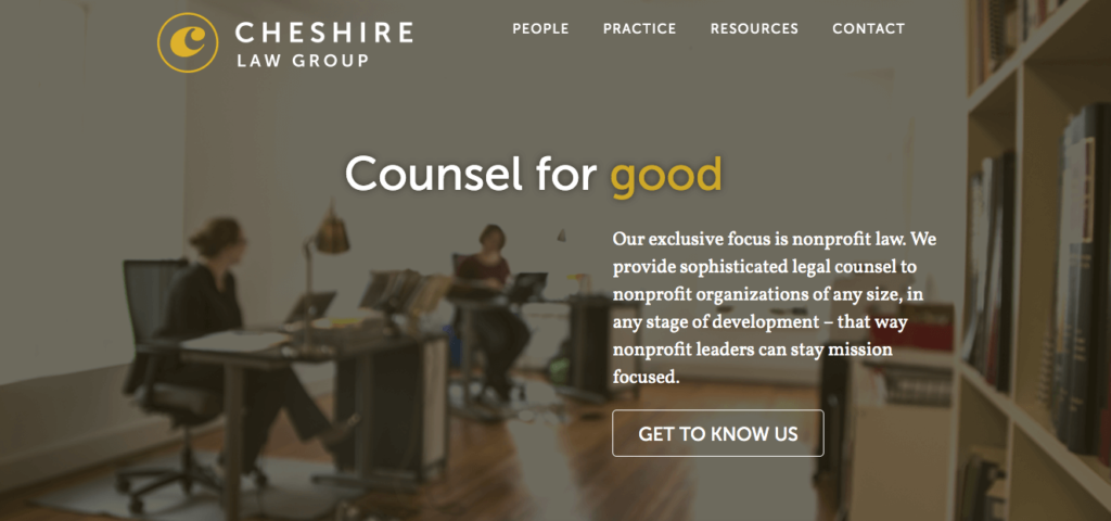
Cheshire Law Group focuses on nonprofit work. Their website is designed to make visitors feel like they are the good guys, and their first CTA is “Get to know us,” so that they can prove it. It would make no sense to have a CTA exclaiming “CALL NOW!!” on a website that exudes such a calm, noble feel.

Cheshire law group home page

An overly aggressive call to action may cause website users to leave the page forever. That’s a potential cause for losing potential clients, all because your CTA sent the wrong message. Based on the type of clientele Cheshire Law Group wants to attract, and the altruistic organizations they work with, the friendly “Get to know us” is a gentle yet effective CTA that works perfectly with their tagline, “Counsel for good.”

2. Use a hook

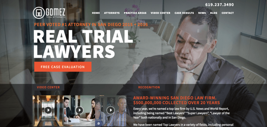
It is always helpful to add a hook to grab your reader’s attention so that they’re more likely to click your CTA. The first thing you see when you open up the Gomez Trial Attorneys homepage is a large orange button that says “Free Case Evaluation”. Since potential clients may be worried about legal costs, the word “Free” instantly addresses their concerns.

Gomez trial attorneys

While every law firm should reevaluate the language on their website based on their services and target audience, it can be helpful to look at other industries for effective call to action examples as well.

On Dropbox’s website, there is a big blue button that says “Try it Free” with the words “No credit card needed” underneath. Dropbox is removing as many barriers as possible to make it even more enticing to use their product. Not only can you try it for free, but you can also get access to the product without having to drop credit card information. In this modern age where it feels like you have to hand out personal information to get access to anything, this is a welcome relief and may be the extra push users need to get them to decide.

For law firms, deciding to offer a free consultation can be an intriguing way to lower barriers to clients hiring you.

While some law firms require users to fill out a form connected to their client intake software as the first point of contact, others encourage a phone call. How easy do you want to make it for users to contact you? I encourage a lower point of entry to convert site visitors to potential clients.

3. Segment your site visitors

Not all who visit your law firm’s website are alike, and you may want to create different CTAs designed for different groups. For example, PayPal offers a split screen with two different CTAs, each for its own type of customer. From the very first page, PayPal segments its personal and business site visitors so that it can better serve them later on. This is helpful in circumstances where your firm has more than one specialty and wants to segment potential clients right from the start.

Why not tailor your website directly to what a potential client needs? If you have more than one specialty, or more than one type of client, using more than one CTA might be appropriate to segment users and offer a more relevant experience. Your real estate transaction clients don’t want to see content directed at probate clients. Keep the two separate and offer a better user experience overall.

4. Make your CTA stand out

Spotify’s homepage is incredibly bare compared to most other websites. The website simply states: “Music for everyone. Millions of songs. No credit card needed.” The CTA button is also simple: “Get Spotify Free.”

Why is this effective? Because they assume users already understand what Spotify offers. They don’t go into detail explaining how music streams, because they assume that users who have reached their website already know how, and are ready, to stream music. Instead of clutter and superfluous language, they have a clear call to action button.

Your law firm’s homepage will likely have more language since the average user has limited knowledge of the law, but we can take guidance from the clarity of the CTA button on Spotify’s website.

Their CTA button stands out: While the background of the website features warm colors, the button is bright green.

This button is a good example of appropriate color contrast and size. Every CTA button, no matter the website, should be immediately obvious. Don’t make visitors to your law firm website search for the next action. Make the button appropriately large and in a contrasting color that can easily be seen. Simply changing the button color, without changing any content on the website, has been shown to increase clicks by double digits.

Create a strong CTA, attract more clients

These tips outline some clear best practices for improving CTAs on your law firm website, but it’s important to remember that there’s no one-size-fits-all solution. You will need to examine the type of clients your law firm looks for and what will resonate with them to come up with CTAs for your own website.

Whatever CTAs you choose, make sure they reflect your law firm. Your brand should be present in all your marketing efforts. Don’t use brash language if that’s not true to your law firm. You don’t want potential clients expecting sassiness when actually your firm is more reserved.

Your CTA, like the rest of your website and all your marketing materials, should fit in with your brand and make sense for potential clients visiting your site. Create a relevant and effective call to action that spurs site visitors towards the first step to becoming your client.

Article: View Original Source


With website speed, first impressions really do count. A slow website will harm your law firm. The world operates much faster than in the past. This also means that when it comes to your law firm and your website speed, the faster the better. You typically have around 5 seconds to capture the attention of your website visitors, otherwise you run the risk of them leaving and visiting a competitor’s site instead.

Delivering a fast website experience allows you to build trust with your visitors, keeps them engaged with your content, and helps them understand what you do. Here are 10 ways to improve your website load speed.

With the ever shortening attention span of the mass population, you need to make sure that you have their attention and you can keep it. Here are 10 tips that will improve your website speed.

1. Get a better web hosting company

Slower website speed happens when the servers are overloaded. If you are experiencing issues with speed and you feel like your host may be the culprit, you might want to consider breaking up. When it comes to web hosting, a one-size fits all approach may not be in your best interest.

Advanced servers that are built to serve the masses can be more pricey, but they have faster loading website speeds. The amount of time your customer is waiting for your site to load, can cost you in the long run. Check out this Web Design company with an advanced server. They can speed up your website overnight!

2. Make your website smaller

Bigger isn’t always better especially when inviting visitors over to your website. Large files within the coding may slow down your speed and take longer to load. Making sure to follow basic rules can help maximize your speed on a large website. Such as:

  • Using images sparingly, instead of overloading your website with graphics
  • Compress your files
  • Utilizing Minimal fonts
  • Use proper coding and keep it simple

3. Minimize external requests

By minimizing external requests for content you’re helping to boost your website speed. Instead of having external links, optimizing embedded links to social media can be helpful.

Since these tend to load after the main pages, it can drag down your speed.

4. Don’t use a WordPress theme

WordPress themes have a tendency to come with preloaded codebases that overload your website and make it run at a snail’s pace. One alternative to purchasing a WordPress theme is by having a web developer create a customized website just for you.

If you are still wanting a diy option, try researching some lesser known sites that have a more sleek codebase. Cleaning up your website’s backend will be worth it in the long run.

5. Lower the number of redirects you are using on your site

Every time your URL is redirected and bounces back and forth trying to find the server, it creates a situation to lose website speed. Utilizing accurate URL in your script can help.

If you create a direct path for your scripts and files, then unnecessary redirects will be obsolete and your visitors will see what they need faster.

6. Remove unnecessary plugins

In the event that you decide to add plugins to your theme, double checking that you are only installing what you need will help to make the website speeds more optimal. There’s no need for any extras in this department. It only takes up additional space and doesn’t serve your website.

Some themes come with built-in plugins and while they can help in easier setup of your site, they can drag you down in speed if it’s options that you aren’t using. For example, if you have a physical product and buy a template that has an e-commerce plugin already added, you may not be ready to utilize it at the moment.

7. Compress images

Less is more when it comes to compressing your images. Using tools and software to help create smaller images can help with load times while still maintaining high quality.

You can save a substantial amount of data by implementing tools such as TinyPNG to assist with the compression.

8. Lazy load images

It’s well known that our society is leaning more towards visuals to get our attention. Adding interesting and supportive graphics and images can aid in attracting visitors to you site. Since these images can pull a lot of weight from the speed needed to load successfully, sometimes the images are slow to load.

There’s not much worse than trying to view a page and see the dreaded loading circle spinning and spinning. We as a society are not typically patient people.

9. Scale your images

Adding images to your site can be more aesthetically pleasing to the eye, but the proper sizing of the image is important as well. Changing the scale of your images can boost speed time and help create a visual experience for your visitors.

The larger the image, the more data it takes to download. Making sure you load the proper size image is beneficial to your website speed.

10. HTTP Caching

Navigating the internet with code can be made more difficult since the network and server need to tag team to fetch the website. The traveling of information multiple times can slow down your need for speed.

Ensuring that the correct HTTP cache is valuable. Performance is boosted by the reusing of information stored in the browser’s cache.

There are numerous ways that you may be losing precious time due to poor practices on the backend of your website design and development. Not all is lost, by implementing a few changes you can gain website speed. This will ensure that you’re not losing visitors and they aren’t losing patience from long wait times.

Article: Original Source


It’s 2019 and we can no longer deny the advantages of women in design. As more and more women enter previously male-dominated fields like IT, engineering, and design, companies are realizing the advantage of having women in the workforce. Women are steadily becoming more educated and stepping into roles of power and authority. There’s a long way to go on the equality front, but it’s exciting to see women foraging ahead and taking on new roles at every level of business. While I hope to see an increase in female CEOs and top executives, I am pleased to see the number of women owning businesses, going to school in STEM, and creating a future where equality is real. What do women bring to the design industry? There are plenty of statistics that show women are a powerful asset in the workplace. Women designers have a lot to offer!

5 Benefits of Women in Design

1. FEMALE PERSPECTIVE

There are excellent male designers out there. Unfortunately, even the best designer cannot completely put themselves in someone else’s shoes. That’s why it is helpful to have a variety of different contributors, so that different perspectives are taken into account. A female designer and a male designer may face the exact same problem, but have totally different solutions. This doesn’t mean that male designers purposefully leave out facets of a project that are important to women. They may not have realized those issues at all. That’s why it’s a good thing more women are starting to join the industry. Female designers allow a new perspective to enter the thought process and can ultimately lead to design being more accessible to everyone. A collaborative effort with a group of diverse individuals can lead to amazing and efficient solutions that one individual or a group of like-minded individuals would have never thought of. Female perspective isn’t a coy term, it’s an important part of critical design thinking. It is important for the industry to acknowledge that women may have a different perspective, which is valuable and likely sorely lacking in their current lineup.

2. DIVERSITY IN THE WORKPLACE

Diversity in the workplace isn’t for PR. In fact, the idea that tech startups and Fortune 500 companies hire women simply for diversity and that they aren’t full contributors is flat-out wrong. The reality is that women add much needed diversity to many companies that is proven to bring real benefits to business. Diversity spurs creativity and innovation in the workforce. A variety of voices means that your business is better suited to provide a robust and inclusive end product. It can also help you recruit and retain talent. Diversity is becoming more and more important to people of all demographics. It is one of the metrics applicants look for in a company. A lack of diversity can drive current employees to look for other work. Diversity is an important factor in how we work and where we want to work. The diversity effect is true for gender, sexual orientations, race, and ethnicities. Having a diverse mix of people opens up perspectives, introduces new ideas, and creates an environment where innovation can thrive.

3. COMMUNICATION AND EMPATHETIC MANAGEMENT

Women are especially good at building relationships with their peers and reports. They do this through collaboration,   Having a woman manager can encourage other people in the group, who might not otherwise participate, engage more actively in discussions and projects. Because women are less likely to focus on competition and generally more comfortable sharing power, other people who might normally feel uncomfortable in groups might be encouraged to share. Of course, men can be good communicators and empathetic managers as well. And some women can be terrible managers. Let’s not stereotype and entire gender. However, the social skills that women are typically drawn to and are reinforced in our society include active listening, thorough communication, and compassionate understanding — all qualities that can help managers be effective leaders.

4. APPEAL TO WOMEN CONSUMERS

Women represent an important part of the market and over $29 trillion in global sales Having female designers means getting an inside look at the pain points and concerns of over half the market. Women represent slightly over half the consumer market in the United States, but they do a disproportionate amount of the purchasing. Over 90% of household purchases are made by women. That’s not just dish soap and groceries. This includes major purchases like cars, appliances, and power tools. That’s incredible purchasing power! However, despite the purchasing power of women, many companies are falling flat in their approach. The marketing standby to “shrink it and pink it” that has been popular for decades (anyone remember the disastrous “Della” laptop marketing campaign is still prevalent today. Female consumers are getting fed up with this condescending approach, and there’s an easy solution. Women in design offer an opportunity to create products that will appeal to women without being slick and artificial. Products made for women, by women, are much more likely to hit the mark as the designer is a test market already. They are also more likely to suggest products, apps, and websites that women will use that are currently missing from the market. Because men currently lead most startups and tech firms, there is a distinct lack of women-centric products that have the potential to make it big. Case in point: an app to track your period is relatively new. When designing products, websites, branding, etc, it is crucial to keep the female consumer in mind as she represents such a large percentage of total sales in the United States. The best way to do that is by including female designers in your business.

5. FINANCIAL ADVANTAGE

It is important to encourage women in the workforce and to lift each other up. But what might convince companies to hire women for web design, development, cybersecurity, and other tech jobs is that it’s statistically proven that businesses that are gender-diverse are 15% more likely to outperform competitors. Businesses cannot ignore the fact that hiring more women can boost their earnings. There might be several factors that gender-diverse firms outperform including the diversity quotient, representative marketing, or productivity. Although there is a persistent perception that women talk more at work and therefore don’t contribute as much, that theory has been proven false. If women are chatting, it’s not hurting their overall productivity, which is 10% higher than men’s. For a variety of reasons, women have proven themselves a valuable asset in tech. Ultimately, startups and other businesses can’t afford not to hire women. Across the board, women make a difference to the productivity, creativity, and profitability of businesses. So if you don’t care about the success of your business, never hire a woman! The tech industry needs skilled and/or experienced workers. There are thousands of open jobs, and women are rapidly taking coursework and sharpening their skills to take those positions. There are so many advantages of having women in design, it will be fascinating to see where the field goes next.

Article: Original Source 


Your law firm is ready for peak performance this year. Is your website?

If it hasn’t been updated in a while, take the time to evaluate whether your website is still serving your firm’s needs. Is it communicating the right message? Easy to use? Ready to help you convert leads into clients? You don’t want to do all the work and commit to the cost of driving people to your website through social media, paid search and digital advertising, only to have them bounce off the site due to performance issues.

Three Steps to Ensure Your Website’s Performance Is Up to Snuff

There are plenty of things you can do to boost your site’s performance. For example, you might be thinking about adding call tracking or live chat. And if you use WordPress, you may be considering upgrading to the Gutenberg editor, which I wrote about here. Before you add features, however, make sure to conduct a website audit that covers these three basics.

1. Make Sure It’s Clear What Services You’re Offering

We’ll get to the technical things, but it’s important to do the foundational work when starting a new website or auditing your existing one. The answers to all of these questions should be apparent on your website:

  • Who is your ideal client?
  • What services do they look for?
  • How do you provide your ideal client with solutions?

The homepage should immediately tell users what problems your law firm is solving. Does it?

  • Are the headlines and images appropriate to the page? That beautiful city skyline at night may look nice, but does it convey what you can do for clients? Finding relevant images is harder but they are much more relatable to potential clients than stock photos of a city or a gavel.
  • Is your website content clear? Is the text on your homepage and services pages about clients and how you can solve their problems — or is it more focused on your law firm and its accomplishments? Of course, your bio, awards and accomplishments are important. But that information is for the “About us” page, not the homepage.
  • Is it clear how people can reach you? Do you offer multiple points of contact — phone, email, contact form, live chat?

Your website should be focused on your clients and how you can serve them. Make sure it communicates the right things.

2. Get Outside Reviewers to “Kick the Tires”

One of the best ways to rate your website performance is to ask someone else to review your site. Come up with a short list of tasks such as: find my website, contact us, sign up for our blog. Ask a few friends and colleagues to take a video of themselves completing these tasks on their computer, or look over their shoulder as they complete the tasks. Here are some questions to consider when watching someone else navigate your site:

  • Does it take the users a long time to find your website through search?
  • Does your website load easily? Is it slow? Do any broken images appear?
  • Is your site easy to navigate?
  • Are there distracting graphics, pop-ups, sliders or other features that make it difficult to navigate the site?

Looking at your website through fresh eyes will quickly show which features are working and which are not. You’ll be able to see firsthand how users experience your site. Site speed, in particular, is key because users are likely to leave the page if it doesn’t load within a few seconds.

Afterward, ask your testers for feedback. They may have noticed issues that you glanced right over.

3. Ensure Your Site Is Secure

In 2019, every website needs an SSL certificate. This is what leaves an “https” at the beginning of your URL and lets users know that you are serious about confidentiality, security and keeping your website up to date. Everyone needs this. If you have a log-in for your website, it needs to be secure.

Many lawyers think that because they do not accept client payments on their website, they don’t need an SSL. Regardless of payments, you are accepting information on your website. Your “contact us” form gathers email addresses and other information.

Most law firm websites are WordPress sites. Because this is the most popular content management platform, it is also the one most often targeted by hackers. If your website gets hacked, it can get blacklisted. This will make it difficult to send emails and can lead to bigger problems down the road.

The SSL is also important for SEO. Google considers the website’s security when ranking in search. If your law firm’s website is not secure, it will be penalized in organic search. Website performance in Google search is critical, so this — as well as issues like speed and load time — can really hurt your traffic even if your website never gets hacked.

An Annual Website Checkup Is Always a Good Idea

Every law firm is different, with different needs. When reviewing your website performance for 2019 standards, it’s important to take into consideration your practice, your various services and your clients. If you don’t have the technical acumen or time to complete an audit, you can outsource it.

Article: View Original Source